SHEDD AQUARIUM BROCHURE
OVERVIEW
BRIEF
This brochure serves as a comprehensive source of information about Shedd Aquarium, including details about exhibits and details the featured organisms. It educates potential visitors about the aquarium’s attractions and offerings.
Created using my photography during a recent visit to the Shedd Aquarium.
Typography: Avenir Next is a sans-serif typeface and its design features a combination of humanist and geometric influences, with a focus on clarity and legibility. In the context of a brochure, that needs to be easily read, this legibility is vital.
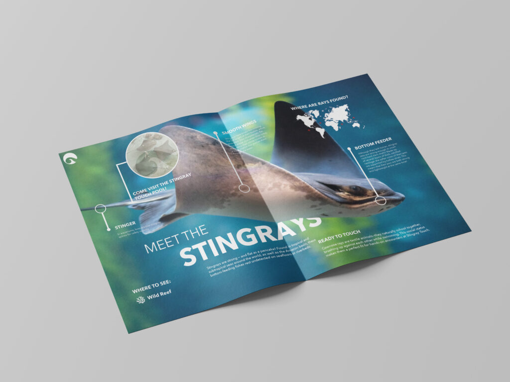
BROCHURE CONSTRUTION
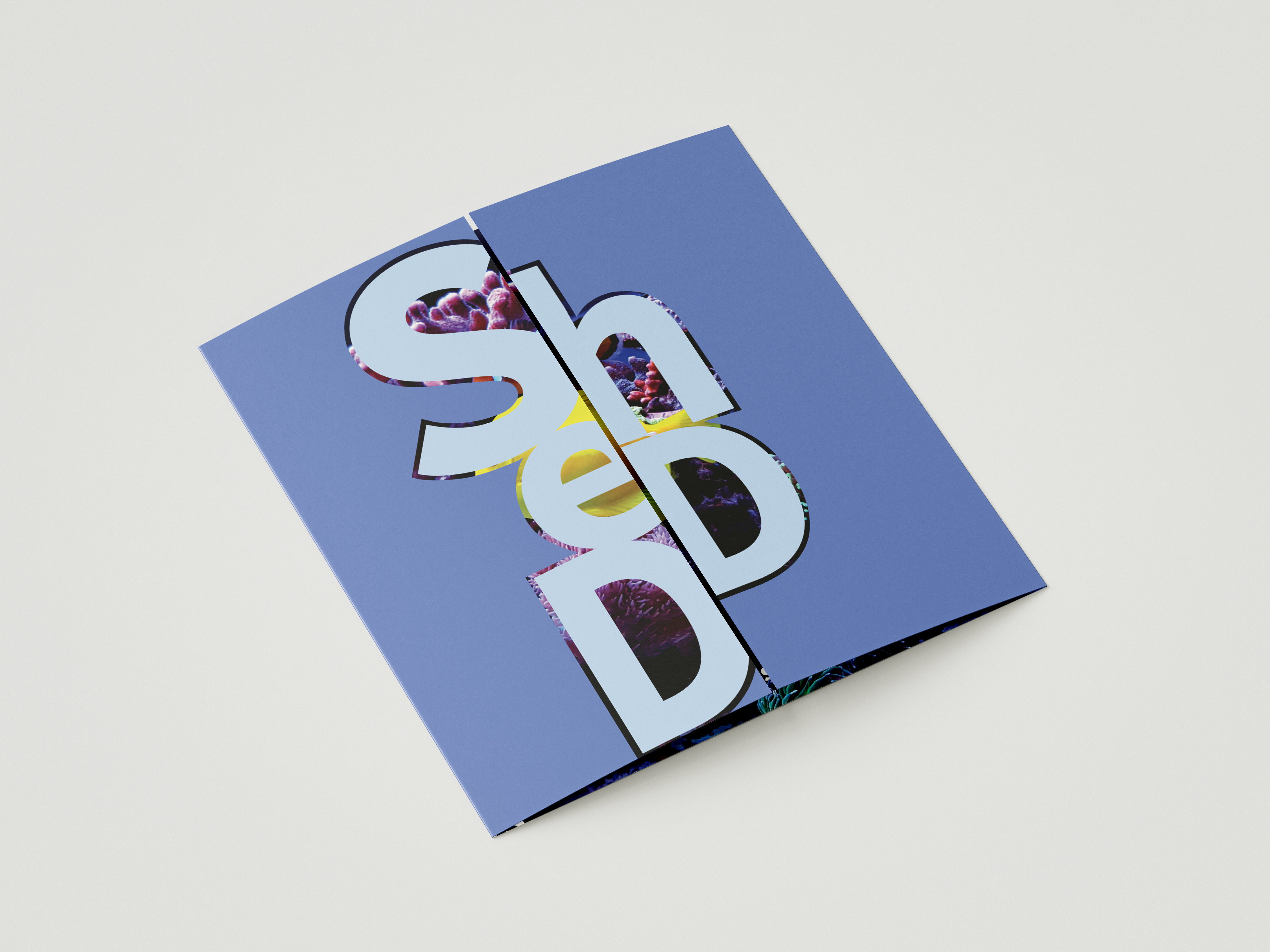
OUTSIDE GATEWAY FOLD
The brochure is constructed like a gateway brochure. Both exterior flaps, when together, make up the word ‘Shedd.’ The user is able to see the inside of the brochure through the letters.
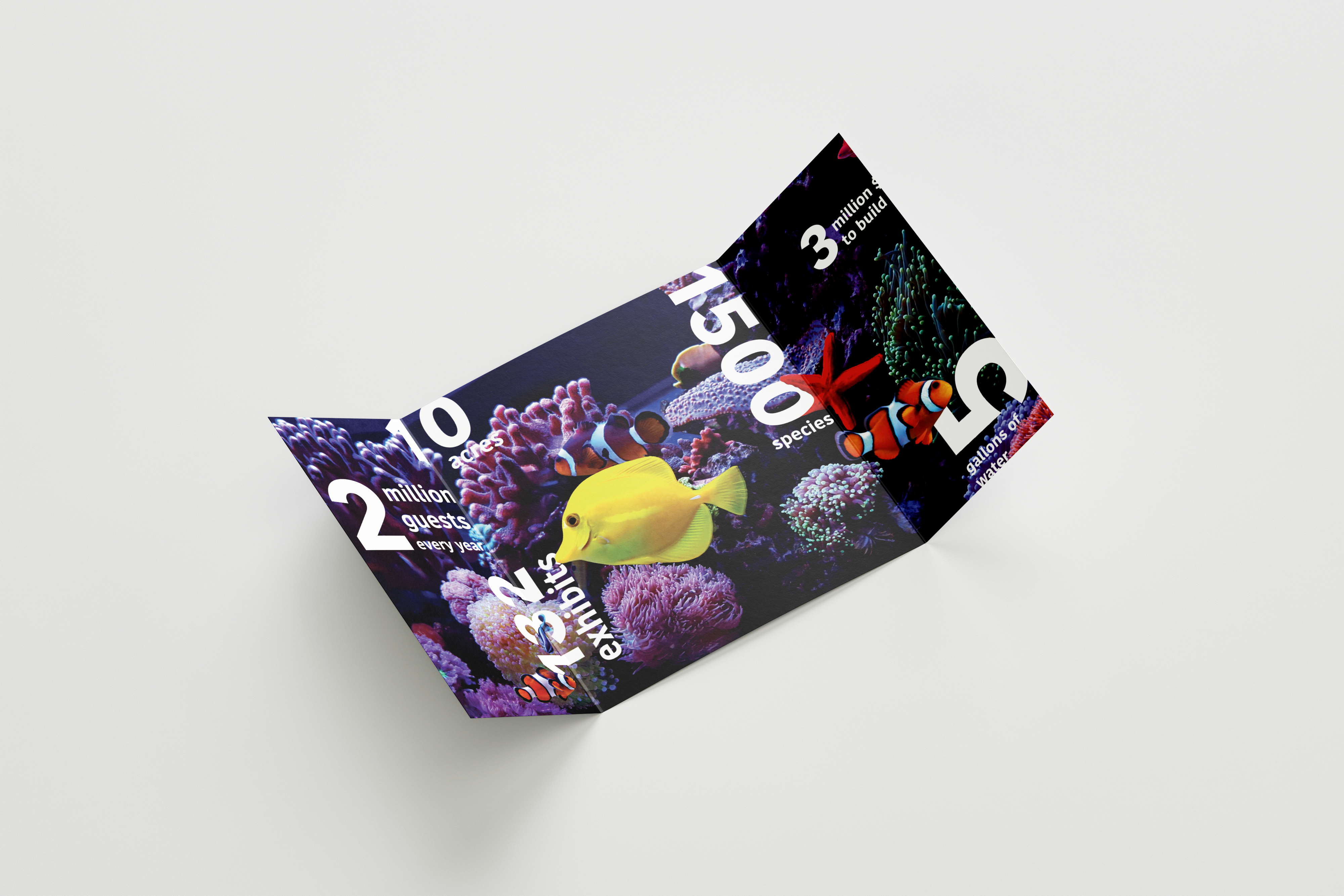
INNER SPREAD
Once the flaps are open, the user can view the inside, an aquarium photo with Shedd statistics in white typography. In the middle, there is a separate booklet, with the cover being the same as the middle component of the inside.
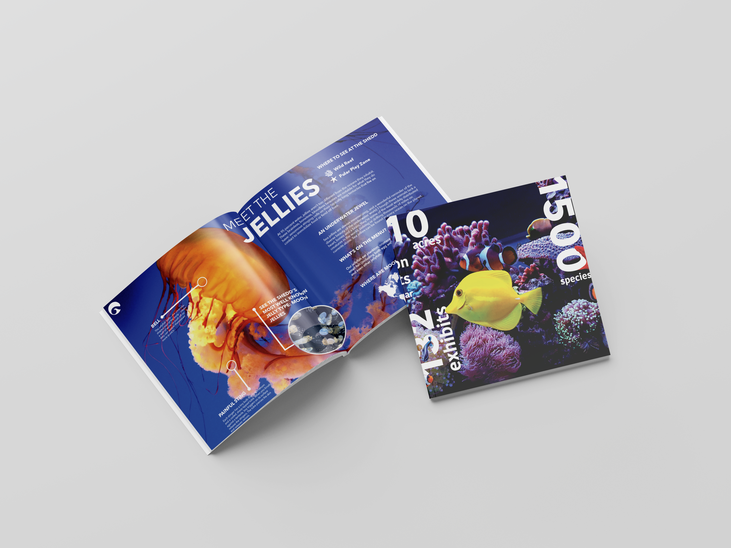
SEPARATE/BREAK AWAY BOOKLET
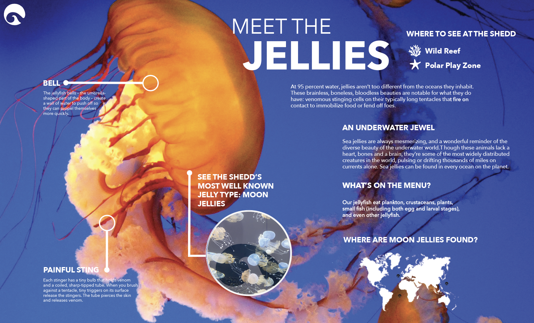
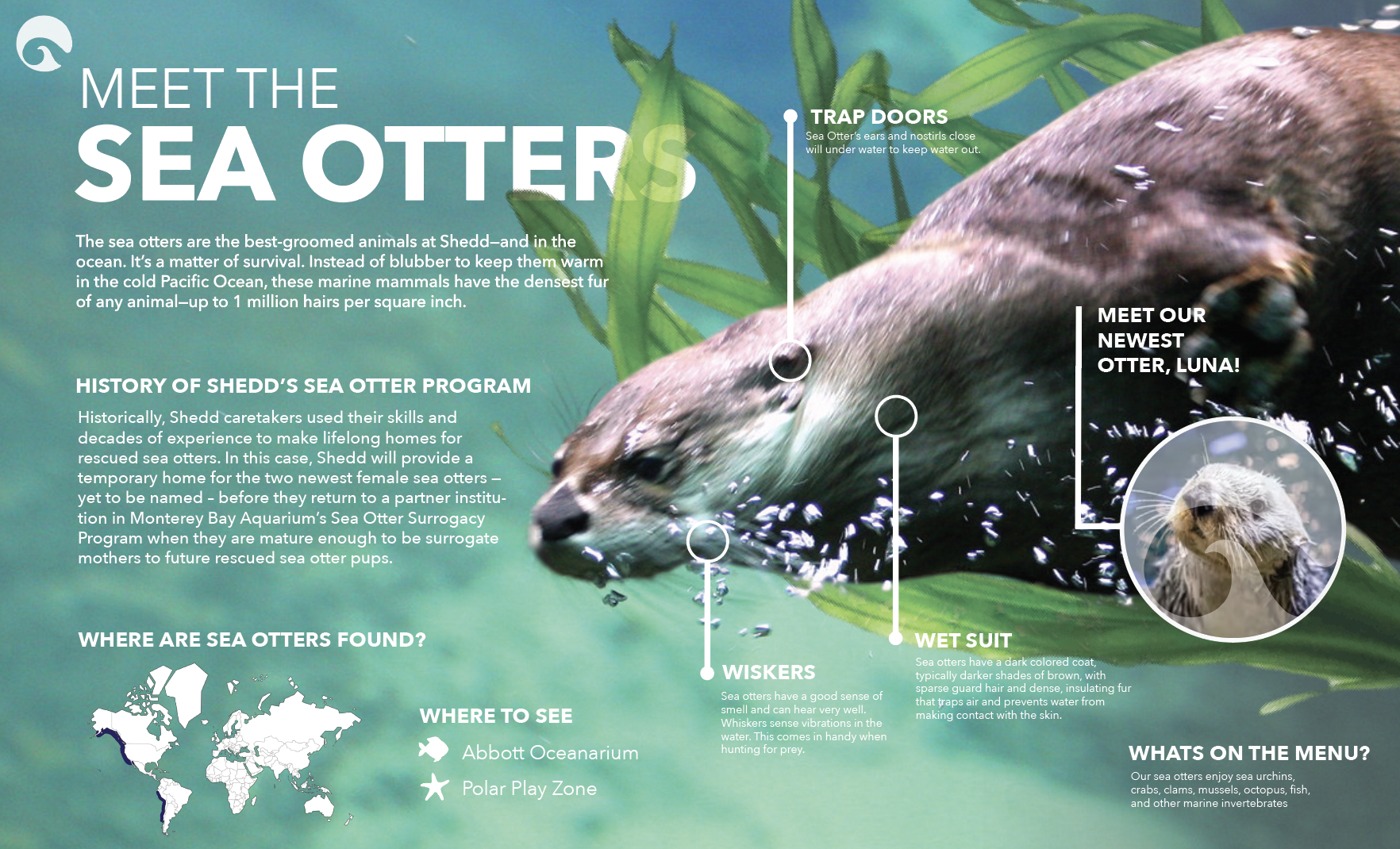
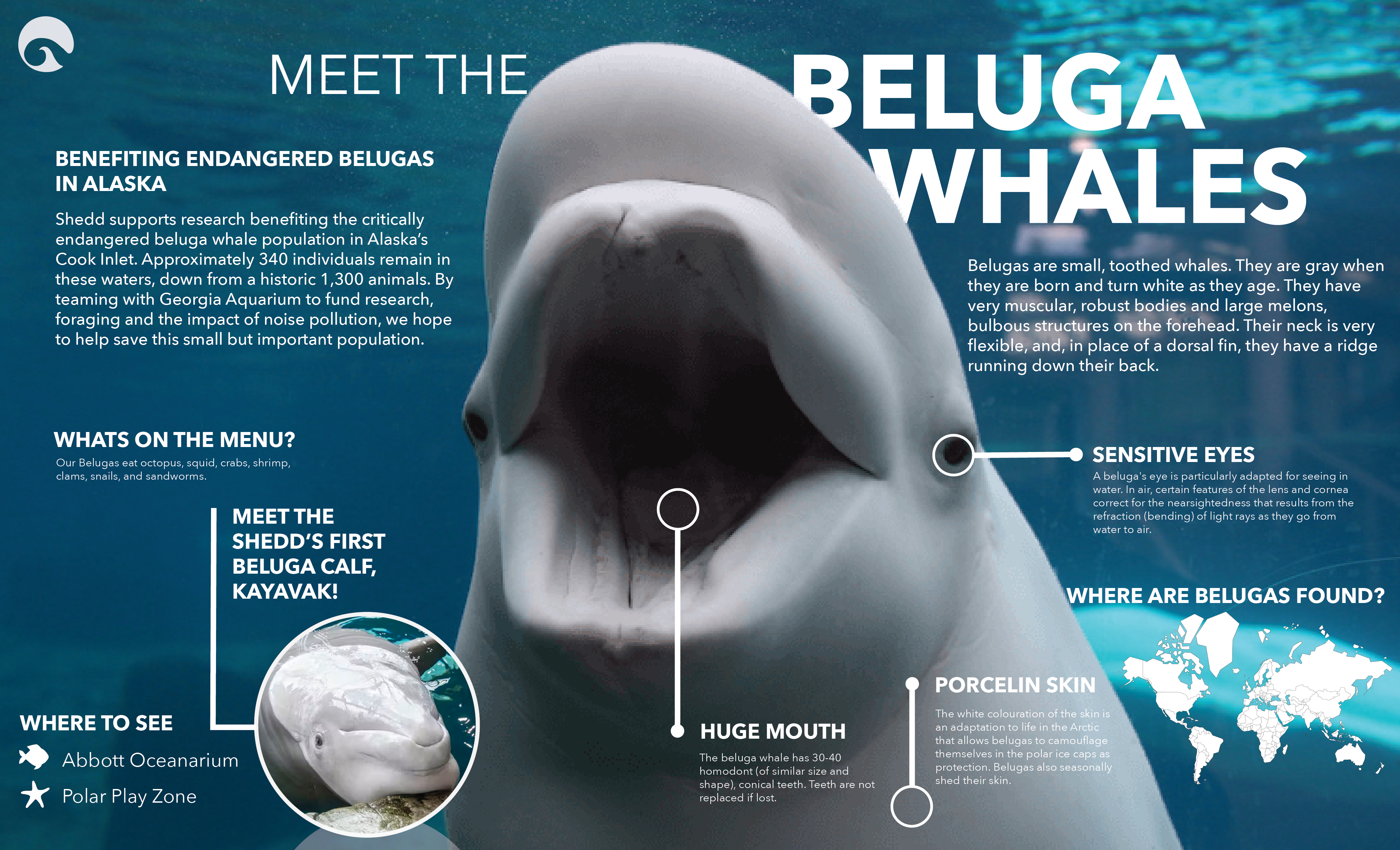
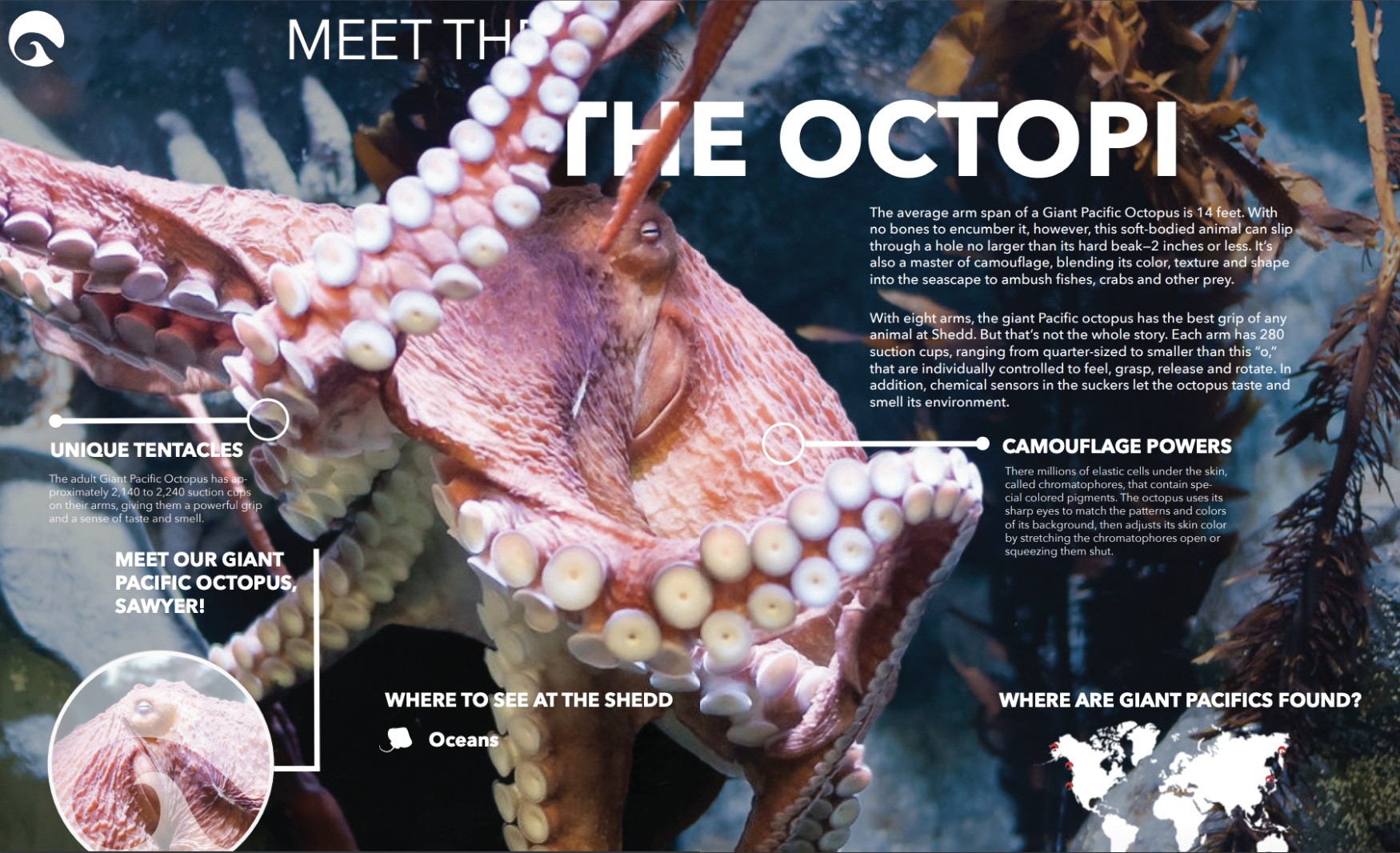
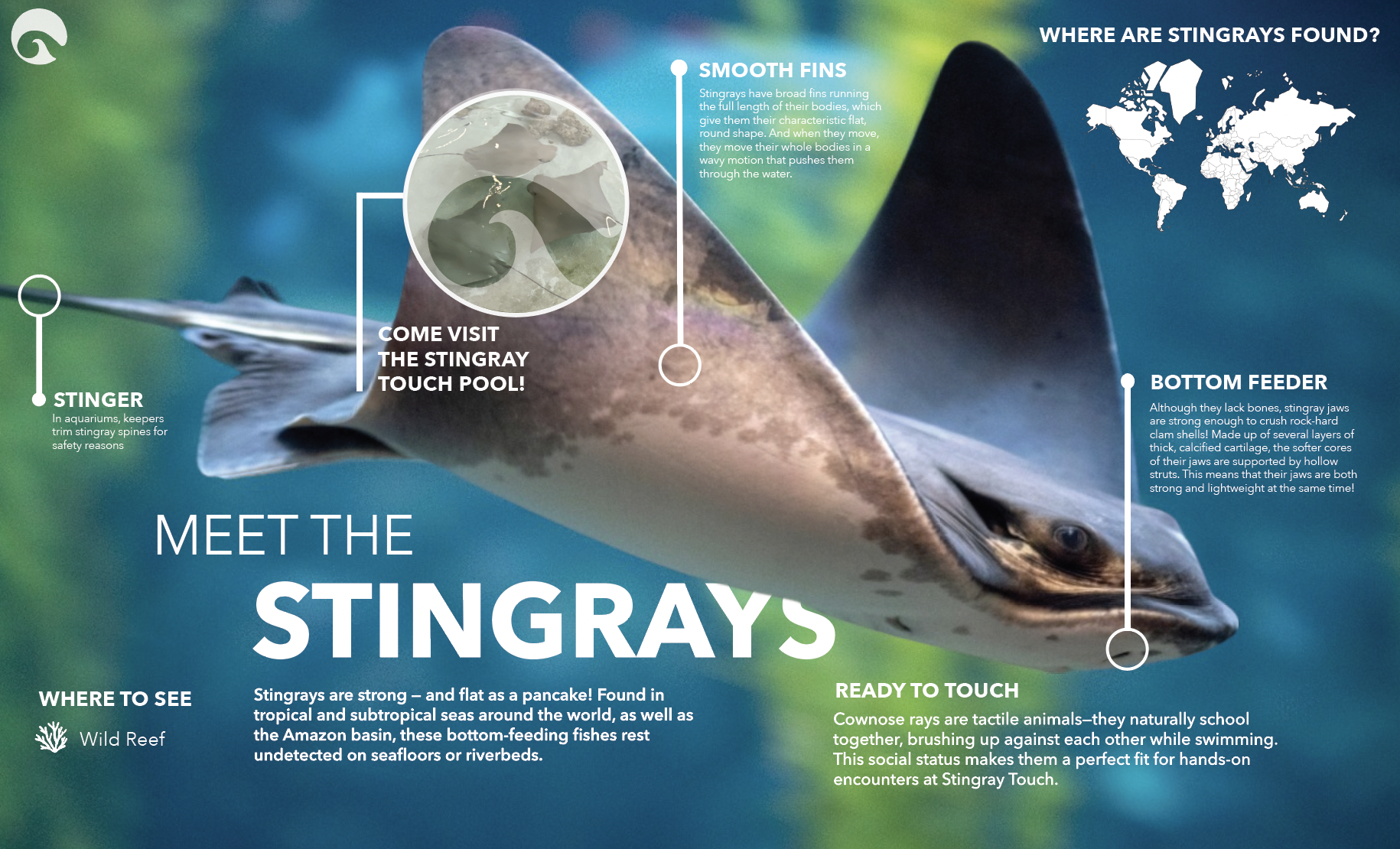
Once taken out and opened, the separate booklet displays full spreads of aquarium information. Each spread highlights a featured organism.
INDIVIDUAL PAGES

SADEY HAVEL
GRAPHIC DESIGNER


